It’s been a while since the last Google Play design change. The great G, which has been renewing some of its most popular applications for Android for a few months, has decided that it is the turn of the application store, which could very soon launch a new interface that is much clearer and cleaner than what we are accustomed.
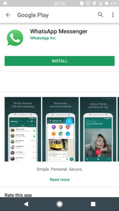
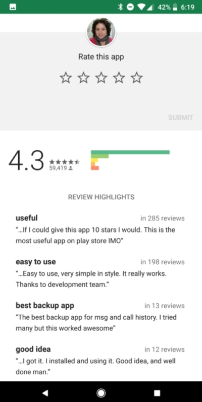
The changes have been discovered by Android Police, since apparently, Google would be conducting a testing phase with this major design change in Google Play, before carrying out the global deployment of the app with the new look. Next, we see “the new Google Play”, in images.
Must Read: Latest Google Play Store with new UI now rolling out to more users
Google Play is preparing for a major design change
Despite the fact that one of the characteristic features of the Material Design style is the bright colors, Google seems to have the intention of setting aside the differential color of its design lines. It has already done with several applications such as YouTube, it forgot the red color to welcome the white. According to the images we have access to today, Google Play will be the next to say goodbye to its characteristic color; the green, giving way to white.

Comparing the images, the changes of the new version of Google Play with respect to the current one are more than evident. Beyond the new color -or the lack of it, rather-, we see how certain components of the interface have changed, such as the cards on which the recommended apps are located or the button to install the applications, which now occupies all the width of the screen instead of a corner at the bottom right.
We do not know if this design is final, or if Google is still working and this is just a preliminary version of the next big Google Play renewal. Even so, we may see that within a short time, more users begin to receive the new style of the store on their phones until Google decides, or not, to make the change official. We will keep you informed about it.
Varun Kesari
Blogger | Youtuber | Music lover | Tech enthusiastic | Proud To be INDIAN

